
Written by Huong Totten
Clients hire a marketing agency to build a website, and they expect to talk about layouts, fonts, and content management systems. We end up talking about who they are.
That’s not a bait-and-switch. It’s the work. By the time a website goes live, the visible part — the design, the words, the structure — is a downstream effect of decisions that got made weeks earlier in conversations that didn’t look like website work at all. Conversations about what the firm actually does. Who it’s for. Why anyone should care. What it doesn’t do, and shouldn’t pretend to.
A site that looks polished but skips that work reads as polished and empty. A site that looks plain but is built on real clarity reads as honest and credible. Sophisticated allocators can tell the difference inside ten seconds.
This is a reflection on what those weeks look like and on a distinction we’ve come to take seriously: sometimes we work alongside a client’s marketing team, and sometimes we are the marketing team. The work is similar. The room is different.
The first month is not a design month
The first month of a website engagement, for us, usually doesn’t produce a finished website. It produces a critical conversations, productive ones, about positioning.
Take audience. A firm might walk in assuming the website is for “investors” and discover, after two or three meetings, that “investors” is four different audiences pretending to be one: retail buyers who arrived through a parent brand, the RIAs and financial planners the firm now actually wants to reach, the platform companies and gatekeepers who decide which funds get distribution, and the trust departments and family offices that come in through entirely different channels. Each of those readers needs a different first sentence. Writing for all of them produces copy that lands with none of them. The first month is often spent narrowing.
Then there’s the strategy question. A firm with six investment approaches — say, a small/mid-cap quality strategy, a global dividend strategy, a sustainable global dividend variant, a natural resources strategy, a large-cap value and all cap — has to decide how those get grouped on the site. By style? By geography? By the problem they solve in an allocator’s portfolio? Each answer changes the site map and, more importantly, changes the implied story about how the firm thinks. Grouping by geography says we’re a multi-strategy shop covering the world. Grouping by the problem they solve says we’re a portfolio-construction shop, and here are the building blocks. Both can be defensible. They’re rarely defensible for the same firm.
This is also where assumptions inherited from a parent company, a prior brand, or a long-running internal mental model usually get challenged. “We’ve always talked about ourselves this way” is one of the most expensive sentences in the room, because it tends to be the moment the firm realizes the way it has always talked about itself no longer matches who it’s actually trying to reach.
We build the skeleton early, because we want to avoid abstractions
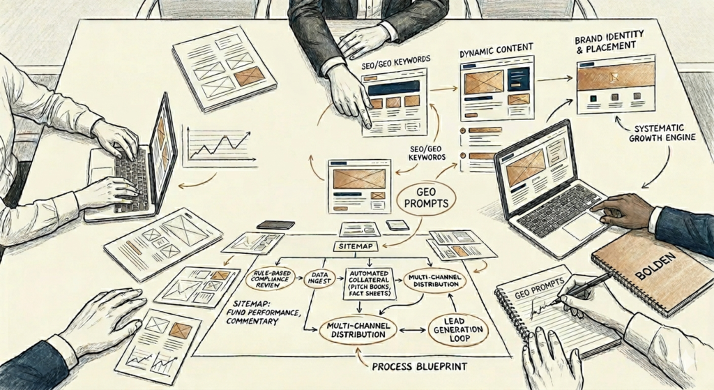
So we build a working skeleton of the site after the first meeting. Sometimes the same week.
Not because the positioning is settled — it isn’t. The skeleton goes up specifically because positioning isn’t settled, and abstract positioning conversations go in circles. A client can debate about brand voice and audience for hours. The same client looking at a real homepage on a real screen, with their logo and their strategy names in place, will tell you in five minutes which sentence is wrong, which section is in the wrong order, and which language doesn’t sound like them. The site becomes a thinking tool, not a deliverable.
What’s interesting is what survives. The skeleton’s bones — the navigation structure, the order of major sections, the way strategies and vehicles relate to each other, where the team appears, where the data lives — usually hold from that first build all the way to launch. What changes is everything visible inside the bones: the copy, the imagery, the design language, the color palette, the icons, the hero treatment, the diagrams. The first iteration and the launch version often look like different sites. They’re the same site. The argument underneath got refined, and the surface caught up.
This sequencing only works because the build is fast and cheap relative to the thinking. If putting up a skeleton took six weeks, we’d avoid it and try to settle everything in conversation first. Because it takes days, we can use the site itself as the place the conversation happens.
The architecture is the argument
The second piece of work people don’t expect is how much the order of the site matters.
Where the company statement sits. Whether the firm’s vision comes before its products, or products come before vision. Where the team appears, and whether they appear by name first or by role first. Whether strategies are grouped by what they do or by who they’re for. Where the data lives, and what shows up when the data isn’t there yet.
These are not design decisions. They’re argument decisions. The structure of a site is the structure of the case it’s making. Move the team section above the strategy section and you’re saying trust the people first. Move strategies above the team and you’re saying the work speaks for itself. Both can be right. They’re rarely both right for the same firm.
We’ve found that allocators care, in this order: who you are, what you believe, what you do, and then how you do it. Most fund websites get that order wrong, leading with the what and burying the who. By the time a sophisticated reader gets to the part of the site that explains who’s behind the strategies, they’ve often already decided whether to keep scrolling.
A compliance moment that becomes a design moment
One of the more interesting design considerations we run into is also a compliance requirements.
A firm might offer the same investment idea — small/mid-cap quality, say — in two different vehicles: an ETF and a separately managed account. From the firm’s point of view, those are siblings. Same portfolio managers, same research, same convictions. From a regulatory point of view, they’re not siblings at all. The ETF is governed by Rule 6c-11 and has its own website posting requirements: daily portfolio holdings, NAV, market price, premium or discount, 30-day median bid-ask spread, historic premium and discount tables. The SMA is governed by the Investment Advisers Act, runs on GIPS-compliant composite performance disclosures, and has none of those daily-data obligations.
If a site presents the two side by side without a clear visual distinction, an investor can come away with the wrong impression about which numbers apply to which vehicle — and a firm can come away with a real problem.
So a question that starts as “how do we group the lineup?” becomes a question about how to show two related-but-different products on the same page without conflating them. The answer is usually a structural one: each strategy gets a page that names the strategy first, then presents the ETF and the SMA as distinct vehicles underneath, each with its own data block, its own disclosures, its own inquiry path. The ETF block carries 6c-11 information. The SMA block carries the GIPS link, a fact sheet on request, and a different call to action that reflects the different distribution path. They look related because they are. They look distinct because they have to be.
That kind of decision doesn’t surface from a layout discussion. It surfaces from a conversation that has compliance counsel, the portfolio team, and the marketing function all in the same room early enough that the design can absorb the constraint rather than fight it.
Designing for discovery, not just display
A few years ago, a fund website was a destination. Someone heard about you, looked you up, and read what you’d written about yourself.
That’s not how it works anymore. A growing share of the people researching your firm start with an AI query — Perplexity, ChatGPT, Google AI Overviews. They ask a question, get a synthesized answer pulled from sources across the web, and may never click through to a single fund site. Your own site is one input among many, and if it isn’t structured in a way these systems can read and cite, it doesn’t show up in the answer.
This is what Generative Engine Optimization, or GEO, is about. It changes how a site needs to be built. Headings phrased as questions an allocator would actually ask — what is the firm’s edge in global dividend investing? — rather than headings that read like brochure section titles. Answers written so they stand alone if quoted. Strategy descriptions structured so an AI can pull a clean three-sentence summary that holds up. Disclosures, fact data, and team bios marked up so machines can find and trust them.
We’ve done this for clients before, but always as a retrofit — going back to a finished site and restructuring it. Recently, for the first time, we built a site with GEO baked into the design phase from day one. That changes the work. Strategy copy gets drafted with the AI-query format in mind from the first round, not the third. Headings get architected before the design is finalized, not bolted on after. The result is a site that is differently findable. Not different to look at. Different to be discovered. That client is starting strong in a way most firms have to work years to earn back.
When the client has a marketing team, and when they don’t
The relationship part of this work is where we’ve learned the most over the past year.
Sometimes the client has a marketing team. They have a marketing lead, designers, brand standards, opinions about voice and tone, a content calendar, and existing relationships with PR firms and platforms. In that engagement, we are a partner. Our job is to bring expertise the in-house team doesn’t have time to maintain — the AI-native production stack, the GEO discipline, the institutional-finance compliance instincts — and to push back constructively when their internal habits are pulling against what the audience actually needs. The work is collaborative, sometimes intense, and the best version of it looks like two teams that respect each other’s judgment. A typical week includes a copy revision from their side, a layout iteration from ours, and a call where someone from compliance gets a vote.
Sometimes the client doesn’t have a marketing team at all. The investment team is doing the strategy work, the operations team is doing the operations work, and the marketing function is, effectively, an open seat at the table. In that engagement, we sit in that seat. We’re not the agency the marketing team manages. We are the marketing team. That means we own the positioning calls, the voice, the brand decisions, the editorial judgment — and we make those calls with the same care a senior in-house lead would, because for the duration of the engagement, that’s what we are. The check-ins are different. The escalation paths are different. We’re presenting strategy to the CEO directly, not to a marketing VP who then presents to the CEO.
Both engagements produce a website. They produce it through very different kinds of conversation. The first has more meetings, more revisions, more committee dynamics, and more depth on what the firm believes about itself. The second has more autonomy, faster decisions, and more weight on us to get the firm’s voice right without an in-house ear to check against. Neither is easier. They’re just different shapes of the same job.
What we mean by “three months”
The visible build — the site itself — takes weeks, not months. The reason a launch engagement takes around three months is that most of the time is spent on everything that has to be true before the build can mean anything, and on the iteration that happens after the skeleton exists and the firm sees their story rendered back to them for the first time. We also align the site launch with the fund launch.
That moment — when a client reads their own positioning out of someone else’s mouth — is usually when the real edits start. Not the copy edits. The conviction edits. That’s not quite what we mean. That’s what we used to say. That’s true but it’s not the part we want to lead with. Most of the meaningful work in the back half of an engagement is responding to those edits, because they’re the ones that take a site from accurate to true.
By launch day, what’s live on the domain is the small visible tip of a much larger conversation. The firm knows who they are in a way they didn’t three months earlier. The site is just the artifact.
That’s the work. The design and the code are the easy part.
05/20/2026
HT
Bolden builds digital foundations for asset managers — websites, content systems, and AI-native marketing infrastructure designed for credibility, discovery, and growth.